Main Analyses
Death count among age and race group
There were ten races included in this visualization. The subjects which race cannot be identified were indicated as unknown. Thirteen observations which doesn’t indicate the race in the datasets were dropped.
drug_age_group =
  drug_df %>%
  .[!is.na(drug_df$race), ]

bar_plot = drug_age_group %>%
  .[!is.na(drug_age_group$age), ] %>%
  mutate(
  age_group = ifelse(
    age < 18, "<18", ifelse(
      age < 30 & age >= 18, "18~30", ifelse(
        age < 40 & age >= 30, "30~40", ifelse(
          age < 50 & age >= 40, "40~50", ifelse(
            age < 60 & age >= 50, "50~60", ifelse(
              age < 70 & age >= 60, "60~70", "70+"))))))) %>%
  mutate(age_group = as.factor(age_group)) %>%
  ggplot(aes(x = age_group, fill = race)) +
  geom_histogram(stat = "count", width = 0.6) +
  labs(
    title = "Age group vs Death count",
    x = "Age group",
    y = "Death count due to drugs") +
  theme_bw() +
  theme(
    plot.title = element_text(hjust = 0.5),
    legend.position = "bottom",
    legend.text = element_text(size = 8)) +
  guides(col = guide_legend(nrow = 2))

ggplotly(bar_plot) %>%
  layout(legend = list(
      orientation = "h",
      xanchor = "center",
      yanchor = "top",
      x = 0.5,
      y = -0.3
    )
  )
The age group of 30 to 40 year old have most amount of death caused by drugs. The majority death caused by drugs happens from 18 years old to 60 years old, which having a significant decrease for people more than 60 years old. In aspect of race, the white has most death caused by drugs. 2897 white people in age 30 to 40 died because of drugs, which is the most amount of death through any groups. And hispanic white has 499 death because of drugs, which is the second most death among all groups except white . People at middle age more likely died because of an overdose of drugs, compared to elders and younger people.
The death caused by substance abuse in Connecticut is nearly the same distribution between male and female, indicating that the gender would not affect people’s choice of becoming addicted to drugs. The plot for “Major Source of Drug” indicating that women aged 40 or older are at a higher risk of death when using all types of drug. Although women are more endangered of drug abusing, they are not willing to risk their life in their 80s than the man population would for drugs.
Public media often pose the a broad image of adolescent using drugs that leads to death(Partnership news service staff, 2019). Surprisingly, there is noticeable evidence in the “Major Source of Drug” plot that show more cases took place in the population that older than 35 in Connecticut. Alcohol abusing is a remarkable cause of death in this case, trending up with aging.
Despite the similar averages for 4 types of drug, the death from POM for less popular medicines is around age of 50, which could be explained as older people tend to get the prescription more easily.
The fentanyl and opioid are the most common and “well-known” substitute for heroin and morphine, no wonder why they are listed In the top 3 fatalized drugs, even surpasses the poison of heroin over 2012 to 2018.
According to the plot, fentanyl,opioid and heroin all have a heavier tail on the left, given the peak in the 30s around the first quartile. Therefore, we observed that POMs are more poisonous and widely spread in Connecticut than the natural drug.
Trends in death counts across years
Whether the number of people who died due to the drug overdose was rising, declining, or steady is one of the most important questions. To discover the trend of death associated with drug overdose, two line graphs were made and shown below.
Group by types of drug
spaghetti_plot1 =
  drug_df %>%
  drop_na(date_in_month) %>%
  arrange(date_in_month) %>%
  group_by(date_in_month, drug_type) %>%
  count() %>%
  ggplot(aes(x = date_in_month, y = n, color = drug_type)) +
  geom_line() +
  xlab("Year") +
  ylab("Number of death") +
  theme_light() +
  theme(
    plot.title = element_text(hjust = 0.5),
    legend.position = "bottom",
    legend.text = element_text(size = 8)) +
  guides(col = guide_legend(nrow = 2))

ggplotly(spaghetti_plot1) %>%
  layout(legend = list(
      orientation = "h",
      xanchor = "center",
      yanchor = "top",
      x = 0.5,
      y = -0.2
    )
  )
Prevalence of Drugs
spaghetti_plot2 =
  drug_df %>%
  drop_na(date_in_month) %>%
  arrange(date_in_month) %>%
  group_by(date_in_month, drug_name) %>%
  count() %>%
  ggplot(aes(x = date_in_month, y = n, color = drug_name)) +
  geom_line() +
  xlab("Year") +
  ylab("Number of death") +
  theme_light() +
  facet_wrap(~drug_name,nrow = 3,scales = "fixed",shrink = TRUE) +
  scale_x_continuous(breaks = c(2014,2018),
                     labels = c("2014" = "14'","2018" = "18'" ))

spaghetti_plot2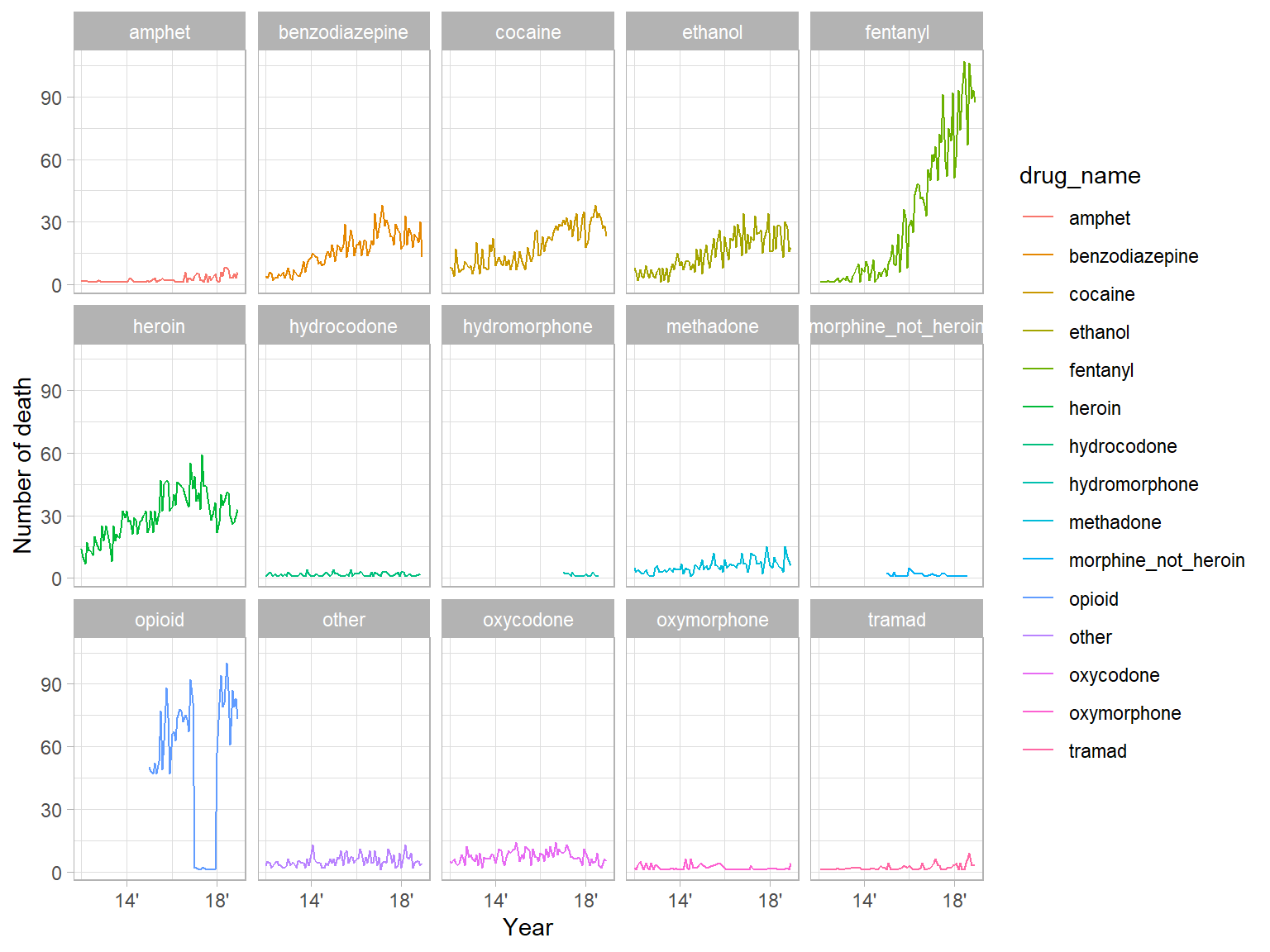
The first graph was made based on the four main types of drugs. From this plot, clear trends can be seen for each type of drug. The trend in death count due to the overdose in drug type ‘other’ is overall steady and remains at a relatively low level. For drug type ‘Alcohol’, the death count is at a low level and the overall trend is slightly increasing. For drug type ‘Natural drugs’, the number of death has an obvious increasing trend from 2012 and it is slightly decreasing after the middle of 2017. As for drug type ‘POM’, there is a strongly increasing trend in the death count and it has the largest number of death among those four types of drugs since 2015. More specifically, there were two rapid growths in the death count related to drug type ‘POM’ between July 2014 and July 2015, and between September 2017 and March 2018.
The second graph shows the number of death due to each specific drug. It can be seen that the drug called ‘fentanyl’ has the strongest increasing trend among all drugs and in 2018 almost over 90 people died per month due to this drug. For drugs named ‘benzodiazepine’, ‘cocaine’, ‘ethanol’, and ‘heroin’, their related death number increased before 2017 and then slightly decreased after 2017. The drug ‘opioid’ has an overall increasing trend but there was a sudden drop in the second half of 2017. Other drugs have a relatively steady trend and the death counts remain at a low level.
Death counts in each month (group by types of drug)
n_plot =
  drug_df %>%
  drop_na(date) %>%
  arrange(date) %>%
  group_by(date, drug_type, year, month) %>%
  count()
Type 1: POM
map_1 = n_plot %>%
  filter(drug_type == "POM") %>%
  ggplot(aes(x = month, y = year)) +
  geom_point(aes(color = drug_type,size = n), alpha = 0.2) +
  scale_color_manual(values = c('#cd7eaf', '#a262a9', '#6f4d96', '#3d3b72')) +
  scale_size(range = c(0.5, 12)) +
  theme_light() +
  xlab("Month") +
  ylab("Year")

ggplotly(map_1) %>%
  layout(showlegend = FALSE)
Type 2: Natural drugs
map_2 = n_plot %>%
  filter(drug_type == "Natural drugs") %>%
  ggplot(aes(x = month, y = year)) +
  geom_point(aes(color = drug_type,size = n), alpha = 0.2) +
  scale_color_manual(values = c('#a262a9', '#6f4d96', '#3d3b72')) +
  scale_size(range = c(2, 12)) +
  theme_light() +
  xlab("Month") +
  ylab("Year")

ggplotly(map_2) %>%
  layout(showlegend = FALSE)
Type 3: Alcohol
map_3 = n_plot %>%
  filter(drug_type == "Alcohol") %>%
  ggplot(aes(x = month, y = year)) +
  geom_point(aes(color = drug_type,size = n), alpha = 0.2) +
  scale_color_manual(values = c('#6f4d96')) +
  scale_size(range = c(2, 12)) +
  theme_light() +
  xlab("Month") +
  ylab("Year")

ggplotly(map_3) %>%
  layout(showlegend = FALSE)
Type 4: Others
map_4 = n_plot %>%
  filter(drug_type == "other") %>%
  ggplot(aes(x = month, y = year)) +
  geom_point(aes(color = drug_type,size = n), alpha = 0.2) +
  scale_color_manual(values = c('#3d3b72')) +
  scale_size(range = c(2, 12)) +
  theme_light() +
  xlab("Month") +
  ylab("Year")

ggplotly(map_4 ) %>%
  layout(showlegend = FALSE)
From the four bubble plots, we can strengthen the assumption that the people are reckless nowadays in Connecticut and has doubled the amount of death occur in 6 years. Moreover, we observe a peak of people dead due to all types of drug in Connecticut during vacation time, mostly December and July.
While the traditional drug causing less extreme over the years, the explosion that people dead because of the medicine is severe starting in year 2015, given average 25 people dead in a month. Along with the year passed, the POM dramatically dominate the leading cause of death. Though natural drugs still appeal to young population(<30), but not really a choice for older.
One of the reasons is that fentanyl is approximately 50 times as potent as heroin. While heroin is more than five times more toxic than morphine and more addictive. Therefore, it is actually an excessively happier but more deadly choice for addicts
Severity comparison across the years
It is important to know how severe the death situation is due to the overdose in each type of drug. Here two heat maps were made to show the severity across the years. The intensity of the color depends on the amount of death related to drug overdose and the y axis shows the time from 2012 to 2018.
Four Main Drug Types
heat_one = drug_df %>%
  drop_na(date) %>%
  arrange(date) %>%
  group_by(date, drug_type) %>%
  count() %>%
  ggplot(aes(x = drug_type, y = date)) +
  geom_bin2d() +
  scale_fill_gradient(low = "white", high = "steelblue") +
  xlab(" ") +
  ylab("Number of death") +
  theme(axis.text.x = element_text(angle = 45, hjust = 1, size = 10), panel.background = element_blank())

ggplotly(heat_one)
All Drug Types
heat_two = drug_df %>%
  drop_na(date) %>%
  arrange(date) %>%
  group_by(date, drug_name) %>%
  count() %>%
  ggplot(aes(x = drug_name, y = date)) +
  geom_bin2d() +
  scale_fill_gradient(low = "white", high = "steelblue") +
  xlab(" ") +
  ylab("Number of death") +
  theme(axis.text.x = element_text(angle = 45, hjust = 1, size = 10), panel.background = element_blank())

ggplotly(heat_two)
In the first heat map, drugs were divided into four main groups. It can be clearly seen that from 2012 to 2018, the ‘natural drugs’ and ‘POM’ have the highest amount of death and the drug type ‘other’, which contains drugs outside those three main types, has the lowest amount of death. Further, by the end of 2018, the ‘POM’ had the highest amount of death compared to others.
In the second heat map, situations of all drugs can be seen. It can be clearly noticed that the drug named ‘opioid’ had a very high amount of death starting from 2015 and it remains at the highest level amount all the drugs. Secondly, the drug named ‘heroin’ has a consistent but very high amount of death from 2012 to 2018. Last but not the least, the number of death related to the drug called ‘fentanyl’ shows a rapid growth from 2012 to 2018 and it has reached a very high level by the end of 2018.
Interactive map
1. Map guidance
The size of points represents the number of cases of drug-related death, and their color scale represents the number of drugs one used. The cluster shows the total number of people in the given area. The larger radius means more people in the area. The right side shows the age distribution and drug usage.
As a news report claimed in mid-2014, Connecticut was on the high end of cocaine use across the nation on a state by state basis; and the south-central part is the region with the highest cocaine use. Our map confirms it: the map shows that a spot near the west side of Middletown gathers the most number of people in drug use, regardless of gender, race or age group. The second-largest place of drug use is near Hartford, the capital of Connecticut. It is clear from the cluster that most of the drug usage was located near the center or southwest of the state of Connecticut. Other locations with high drug-related death regions include Waterbury, New Haven, and Bridgeport.
2. Age distribution
The second chart is a histogram showing the distribution of the age of the cases. Race, number of drugs used, gender and year range can be changed at the side bar.
Still regardless of race, the number of drug used, gender and year range, the second chart implies that the distribution of age is approximately normal, with center at around 40.
Since 2012, the number of people using drugs has been increasing from 354 to 1035 till 2017, the very number is 1012 in 2018.
3. Drug type distribution
The third chart gives the frequency rank of different types of drug used. The top 3 is heroin, opioid, and fentanyl almost in any group.